Today in our seminar we were told to spend the three hours going through some tutorials for after effects. We were instructed to go to videocopilot.net and the first tutorial was called Fly By Title. In this tutorial I learnt how to make a convincing proffessional looking title sequence, this could be used for the titles or credits of my film, as well as being useful for any floating text i might want.
The tutorial helped me to brush up on my after effects skills, reiterating points i already knew as well as showing me some new effects i wasnt aware of. The effects that were used in the tutorial included:
Changing text size, position and opacity.
Changing Hue and Saturation
Changing colour levels which effect the contrast
Creating Null objects, which allow you to add certain effects to your work.
Shortcuts:
Ctrl + d = duplicate
U = Shows current changes/effects on a layer
F9 = Easy Ease Keyframe
V = Select Tool
H = Hand Tool
Z = Zoom
Thursday 24 November 2011
Friday 4 November 2011


Thursday 3 November 2011
DP3 3/11/11
Today we were given a task by Danny, we were told to film a tram between one stop, and the plan was to get some footage and decent sound and edit them together within an hour, finally finishing with a voice over laid over the top. Danny said he wanted to hear crisp sound and to show we had thought about the shots that we were doing and how we would edit them together, after around 40mins of filming we were finished and ready to edit.
We filmed a number of shot of trams coming into a stop and leaving then a few dividing shots from a distance in order for us to be able to edit it to keep up continuity. Having finished filming Ollie recorded a voice over in a sort of David Attenborough style which we think gave a bit of entertainment to the seemily boring video.
Here is the finished product.
http://www.youtube.com/user/ollylolz#p/u/12/mbRGq5WINt0

Friday 28 October 2011
Friday 29th DP3 Feedback.
Today i pitched my final idea for my DP3 project, everyone seemed to like the idea and how i had gone about it, but one criticism was that is was too long and for the number of shots i had story boarded to get them all into 30 seconds would be a squeeze. So instead i was told to go through it again and maybe finish it early giving it the same affect or changing the ending slightly.
The session was very useful and gave me some good ideas of now to change my idea for the better which is what i plan to do now.
The session was very useful and gave me some good ideas of now to change my idea for the better which is what i plan to do now.
Thursday 27th seminar session.
Today we had a seminar with Jools and we were given three tasks to complete within the three hours.
To start with we were told to film something protraying a metaphor inside and outside, not neccesarilly the same metaphor. For our inside shots we decided to use camera angles in order to show a sense of dominance, therefore we did a low shot looking up at Chris to show his authority and a high looking down shot of Sam to show his infeariority. After this we went outside and simply want to show a metaphor of being trapped or not free so we filmed James behind some bars for ten seconds.
With this task we could of taken more time framing the shots and getting the lighting right but overall they worked quite well.
The second task we had was to film the same subject with a three point lighting setup, then remove both lights one at a time and try to get the same effect on the subject, it was clear that this was extremely hard with the equipment we had, with the use of reflectors it might of been possible, but nonetheless is was a good learning experience when it comes to lighting.
finally we were asked to film an interview on the go, we were very rushed when we came to do this, and took our first shot of James walking and tessa interviewing him in a paparazzi style while Chris filmed, this shot was poorly framed and to close to James, with more care it could of been made to look very good.


Language of Film Cont'd
Screen Direction: Logic to the way we watch a film, director will need to take many shot types into account in order to enhance the viewers perception of the film and give the meaning he wants these include: Pan, Tilt, Track, Elevate etc.
When shooting the director must make sure that screen direction is correct, so if your following a character and they exit a camera on the right the next shot they must enter from the left. When filmimg always plan the shots you are going to do and make sure they follow the rules of screen direction and if not structure in the shots in a way to compensate.
Cutting on Action:
"Cutting on action is one of the best ways to maintain the feeling of movement through time and maintaining screen direction and continuity. When editing, it is always best to cut as the talent does something - not as they are getting ready to do something or have already finished the action. If they are sitting, make the cut as they are on their way down, not while they are still standing. Cutting on the action will also hide the cut because the movement of your talent will distract the viewer from the hard cut. Cutting on action also lets you do a very interesting thing called a parallel cut. This is a cut between two similar actions yet involves two different subjects in two different places. For instance, say your subject is a boyfriend going to meet his girlfriend. He walks through a door; she gets into an elevator. You shoot him from the left and her from the right to give the feeling that they are moving towards each other. Cutting as he opens his door and her elevator door closes gives you two similar actions and speeds the action along. The 180 Rule, screen direction and cutting on action work together to bring these two together!"
180 Degree Rule:
This rule constitutes to when film say two characters talking to each and when thinking you must imagined that there is a a line through the two characters you must always stay this side of the characters when filming so not to ruining the continuity, the only time you can cross this line is if the camera physically is shown to move over it e.g. a tracking shot.
Zolly Shot:
These allow you to realise the importance of something that the character has realised, it is done by panning in and zooming out on the characters face at the same time.
Feedback for DP3 ideas.
On Friday i had to present my ideas for DP3 to Jools and the group. I started my pitch with my idea around the choose freedom concept. My first idea was to do with video games and the idea was to show someone choosing a game called freedom and then playing that game on his console, the feedback for this was mixed, many said they liked the idea and the concept but said it didnt really show a freedom from consumerism it rather promoted it, and therefore an action to take for this idea was to change it so it would clearly show a freedom from consumerism.
My second idea also was along the gaming side of consumerism but this time instead the character within would be relentlessly playing video games all day and all night in the darkness of his room, i had planned to show the characters health detierating and junk food boxes piling up, eventually a concerned unknown outsider will burst into his room draw back the curtains and the slogan choose freedom will read on the window panes. This idea got generally positive reviews due to the real sense of choosing freedom and also many said that i would be able to do very interesting things with lighting.
My third idea was to have the character internet shopping buying lots of items, tv's, games, DVD's etc. on each page he looks at will be a advert for a product called freedom and eventually his consumer brain will buy it and his computer will turn off therefore he has chosen his freedom. There were mixed feedback ideas for this many thought it would be to hard to do without showing internet logos and product logos, and many thought it needed further development.
From the feedback it was clear that i needed to storyboard all my ideas in detail, and make it clear how i would shoot each idea. I have decided that i will make my second idea into my film for the DP3 project, because i believe this will give the clearest message and i will be able to some very interesting things with that idea.
Tuesday 25 October 2011
Thursday 20 October 2011
Storyboard for my Idea
Here is a quick storyboard for my initial idea.


Remembering that i wouldn't be able to show logo's in my film because of advertising rights means i will have to change this slightly in order to keep certain things out of shot but i know how i will over come it.


Remembering that i wouldn't be able to show logo's in my film because of advertising rights means i will have to change this slightly in order to keep certain things out of shot but i know how i will over come it.
Tuesday 18 October 2011
Language of Film
Language of Film:
The language of film is everything that makes up a film and what makes it appealing to the audience, composition, light, narrative etc.
Each shot of a film is carefully thought out in order to give some meaning and either tell you about the character or have some insight into the mood, there are many things that a shot can display...
 In this shot from "Angel at my Window" its clear of the conscious choices made by the director in order to portray a significant meaning for the shot. The fact that the girls cardigan and the wallpaper are the same colour show that she is almost fading into the background, the room is very dark compared to outside showing sadness. Due to the ammount of space around the girl shows she is small/weak almost trapped, this is reinforced by the windows being shut. All this can be seen from this simple still, we are encouraged to take this into account when making our own films.
Shots:
Each shot should bring some new information or progress to the audience, jump cuts, dissolving and continous shots are used.
Composition:
As a camera man when filimg you should continously reframe your shot if its continuous in order to keep the composition relative, the rule of thirds should be taken into consideration, always keep the four important points at the focus.
The language of film is everything that makes up a film and what makes it appealing to the audience, composition, light, narrative etc.
Each shot of a film is carefully thought out in order to give some meaning and either tell you about the character or have some insight into the mood, there are many things that a shot can display...

Shots:
Each shot should bring some new information or progress to the audience, jump cuts, dissolving and continous shots are used.
Composition:
As a camera man when filimg you should continously reframe your shot if its continuous in order to keep the composition relative, the rule of thirds should be taken into consideration, always keep the four important points at the focus.
Monday 17 October 2011
DP3 My Idea
For this DP3 project i want to create a short film, which following the choose freedom idea, will make people think about consumerism and hopefully convince people to consume less, the way i hope to do this is have my film revolve around the gaming world, video games are a massive market in today's society with millions buying and playing games. Initially i struggled in thinking of a way i could do this, i knew i wanted my film to have some sort of choice aspect for the character within. I then had the idea that the character within my film would be choosing which game to play on his game console, and he would choose a game called freedom, i think this coincides with the the essence of my idea rather well.
I plan to design my own game art which i can do on Photoshop, i have done this before so it will be very simple. From here the character will insert the game into his console and i then plan to have photos on the screen which will essential be the freedom game, from here i will zoom in on the screen so only the photo can be seen, this photo will then come alive essentially and the character will walk from the camera's location into the free area followed by the slogan "choose freedom". I've thought about this in detail and know exactly how i plan to achieve it. I'll follow this post with my initial storyboard for my idea.
I plan to design my own game art which i can do on Photoshop, i have done this before so it will be very simple. From here the character will insert the game into his console and i then plan to have photos on the screen which will essential be the freedom game, from here i will zoom in on the screen so only the photo can be seen, this photo will then come alive essentially and the character will walk from the camera's location into the free area followed by the slogan "choose freedom". I've thought about this in detail and know exactly how i plan to achieve it. I'll follow this post with my initial storyboard for my idea.
DP3 Fridays Lectures.
After the lecture with Jools on Friday, it became clear to me what was actually expected of us in the brief, we were supposed to be setting out to create something innovative and different, not necessarily something new but a new way of going about it. This meant that i scrapped my first two original ideas and went back to the drawing board. Jools told us about a website called adbusters.org on their website the say that...
From this site i began looking at videos of things that interested me or things that i had heard about, i watched many videos and thought about how i could create something related to them but with my own spin on it, one video i found showed how much food is wasted in New York City. The way they go about it in the video i find very interesting and found their idea very inspiring.


"We are a global network of culture jammers and creatives working to change the way information flows, the way corporations wield power, and the way meaning is produced in our society."

I then found some interesting videos about freeing yourself from the media and consumerism, which i really enjoyed and it is this path that i want to go down for my DP3 project, i plan to do more research and look into different ways i can portray this idea of freeing yourself from consumerism.

Thursday 13 October 2011
DP3 ideas cont'd
Today i had another idea for my first DP3 project. While watching a celebrity version of Who Want's to be a Millionaire the idea of charities came into my head, because on these shows their chosen charities are never huge charities that you see everywhere but small charities that have a meaning to the person. I then thought that i would like to make an advert that promotes a charity that has a personal meaning to me.
I had too ideas about initially to promote people to support smaller local charities or i would choose a charity which relates to epilepsy because my sister has epilepsy. The way i would go about this is research into my chosen charity and go about promoting it so i probably wouldn't necessarily have interviews but more give information about epilepsy and the charity.
I had too ideas about initially to promote people to support smaller local charities or i would choose a charity which relates to epilepsy because my sister has epilepsy. The way i would go about this is research into my chosen charity and go about promoting it so i probably wouldn't necessarily have interviews but more give information about epilepsy and the charity.
Initial ideas for DP3.
When we were told about DP3 in our first lecture and given the brief of what we were going to be doing, one of the first things Deb said was "what do you feel strongly about". From this i straight away got the idea about how people mistreat the hand out of benefits in this country, this idea came from reading a lot of newspapers over the summer while working and a common story that i would come across would either be benefit cheats or large families who get benefits in order to support their families but use that as a way of living.
This reason i feel strongly about this subject was because people who are lying to the government either about disabilities or claiming job seekers allowance when not actually actively looking for work, are basically freeloading off tax payers money. Also concerning parents who have a large amount of children and use this as a way of living and sustaining an income, i gather that it can be a touchy subject but one article i read about a family with eleven children, where a quote from the father was "i love having a huge family i get £30,000 in benefits every year why should i work?". In cases like this thousands are being forked out and people who really need it to live aren't getting the support they need.
I haven't done much research into this at the moment, but if i choose this as my subject i plan to research how tax money is distributed as benefits or job seekers allowance, as well as interviewing people and getting their views on the matter. Hopefully i will be able to find some examples of people who really need benefits in order to survive or support their families, and make a thirty second add which promotes the idea of making benefits distribution fair.
I also know that disabled people or families with disabled children receive benefits because they or their parents may not be able to work because of their condition, and i believe this to be a strong cause to promote a fair distribution of benefits.
DP3 project things to note.
We spoke briefly to Jools today and went over the necessary items that we would need to be note or accompany our finished film for DP3.
- Reccie, including times and showing we have suitable locations.
- Permission, release forms.
- Times of shooting
- Background noise taken into consideration e.g. cars
- Risk assessment
- Weather forecast
- Location suitable for what you want to achieve e.g. shots
- Script: characters, role, performance
- Storyboards: need to accurately show your story
- Props list
- Music clearance
- Mood boards
- Keep blog updated
- Crew list
- Photos of set and shoot
- Schedule: call sheet = times
- Log sheet of shoot e.g. shots, whats gone wrong, sound checks, size/angle and result
Malac: Feedback
Today we showed our finished version on Malac to the group and we had mixed reviews, due to the lack of coordination between our group some people weren't present at the filming or the editing so decisions were made as last minute ones in order to make the film work.
Our film therefore rather than being a dialogue driven piece is in fact a trailer for the film, which as a whole works very well and the shots we took work for the trailer and with the right affects and shots mixed with an over the top soundtrack it fits the bill for what you would expect for a trailer.
Some of the feedback comments were that we should we have worked better as a group an also made sure that we were all present and both the filming and the editing. I believe that with the footage though that there was a sufficient amount of necessary film to create our original idea and i plan you do my own edit showing so.
Wednesday 12 October 2011
Sound for AV
Yesterday we had a lecture with Danny about sound and the aesthetics of sound when it comes to filming.
The audiovisual relationship is not natural but rather a sort of symbolic pact to which
the audio-spectator agrees to forget that sound is coming from loudspeakers and
picture from the screen. The audio-spectator considers the elements of sound and
image to be participating in one the same entity or world.
The result of the audio-visual contract is that one perception influences the other and
transforms it. So that ...
We never see the same thing when we also hear.
We don't hear the same thing when we see as well.
(Edited excerpt: Michel Chion, Audio-Vision)
Part 1: Mechanics
Loudness: Av sound constantly manipulates sound volume. For example, in many films a long shot of a busy street is accompanied by loud traffic noises, but when two people meet and start to speak, the loudness of the noise is characterized as much by the difference in volume as by the substance of the talk.
Pitch: The frequency of sound vibrations governs pitch, or the perceived highness or lowness
of the sound.
Most sounds in life are "complex tones", made up of different frequencies. Pitch helps us
to distinguish music and speech from other sounds. Pitch also serves to distinguish among
objects. Low pitched sounds can often suggest dull or hollow objects,
Timbre: These are often sounds that give feeling or color to a scene i.e. warm sounds for
happiness or dull cold sounds for fear.
Ambiance: Ambiance is the atmosphere of a place so this includes the background noise,
the sounds heard when no diegetic sound is present.
Room Tone: A locations’ "aural fingerprint“ Each room has a distinct presence of subtle
sounds created by the movement of air particles in a particular volume. Room tone is recorded during 'production sound recording' Room tone is used to match the production sound track so that it may be inter cut with the track and provide a continuous-sounding background.
Hyper-real Sound: These are sounds that are over exaggerated in order to be more
prominent,or give more emphasis in a scene.
Establishing Sound: These are sounds that establish a scene, so it may be sound of a busy
street or a quite country side, so even if the audience cant necessarily see the location the
establishing sound will make it known.
Foley: Foley are sounds which are added in in post production, they are artificial sounds
created using a number of objects in order to mimic the sound present in a scene e.g.
coconuts shells used to mimic the sound of horses.
Production Sound: These are sounds which a present when filming so any background sounds
you might encounter while shooting a scene e.g. birds, wind. Outdoor locations can be especially difficult due to the very limited control the film-makers have of the environment.
Natural Sound: These are the sounds of objects that are unaltered so sounds which aren't
emphasized to enhance there present within the film. They are rarely used because they
can be disappointing compared to an altered version.
Malac: Film Day
On Friday we did our filming for the small project surrounding the script Malac, our location had been chosen at Ollie's house using his basement which set quite a good set for the mystery around the script, Steph and Ollie's friend Ryan were our actors. When we arrived at Ollie's it became apparent how small the basement actually was but i think we did very well moving around the camera and our actors to make it work, like all film shoots we came across some problems but were able to overcome them with ease.
What i noticed was different about this shoot than previous ones last year was how much more efficient we were when it came to organizing the shoot and coming up with ideas, it took less than a day to have our final idea and we were able to shoot it in under three hours. As a whole the group worked very well together and everyone pulled their weight.
Throughout our film our main shots focus on Ryan playing the character who is tied to a chair, we tried to show as little of Steph's face as possible to keep a sense of mystery around her character, as well as this we do not show the Malac to the camera, we were able to borrow a smoke machine from the theater department which we used to fill the the box which the Malac was supposedly in, again this connoted mystery. We pretty much stuck to the script but changed a few parts which we thought didnt work or that we believed our actors could achieve better when done another way.


 As a whole the film shoot was very successful and i look forward to seeing the finished edit.
What i noticed was different about this shoot than previous ones last year was how much more efficient we were when it came to organizing the shoot and coming up with ideas, it took less than a day to have our final idea and we were able to shoot it in under three hours. As a whole the group worked very well together and everyone pulled their weight.
Throughout our film our main shots focus on Ryan playing the character who is tied to a chair, we tried to show as little of Steph's face as possible to keep a sense of mystery around her character, as well as this we do not show the Malac to the camera, we were able to borrow a smoke machine from the theater department which we used to fill the the box which the Malac was supposedly in, again this connoted mystery. We pretty much stuck to the script but changed a few parts which we thought didnt work or that we believed our actors could achieve better when done another way.
Tuesday 4 October 2011
Moving Image, DP3.
Today was the first day of second year having chosen my pathway (Moving Image), we were given a brief overview of the year and what projects we would be doing throughout. However to start with we were split into groups given a script and told we had nine days to make it into a short film, it seemed this was just a small starter project to get us back into the swing of things.
The scripts title is Malac and tells the story of two unknown characters in an unknown location, one of the characters is male and tied to a chair while the other is female and surrounds her focus with a briefcase that contains the Malac. The Malac at this stage is unknown to us and we have to decide what we want to make of it or what we want it to be, the script creates a cynicism around this object and the male character is clearly in some distress about it, the script ends with the female character removing the Malac from the briefcase while the male character screams. In our group we briefly talked about how we would shoot the film and locations and roles of the group but we plan to talk more in depth after Jules' lecture on Thursday.
The scripts title is Malac and tells the story of two unknown characters in an unknown location, one of the characters is male and tied to a chair while the other is female and surrounds her focus with a briefcase that contains the Malac. The Malac at this stage is unknown to us and we have to decide what we want to make of it or what we want it to be, the script creates a cynicism around this object and the male character is clearly in some distress about it, the script ends with the female character removing the Malac from the briefcase while the male character screams. In our group we briefly talked about how we would shoot the film and locations and roles of the group but we plan to talk more in depth after Jules' lecture on Thursday.
Sunday 22 May 2011
Interactive Finished


Wednesday 11 May 2011
Typography
Typography: The art of arrangemant, style, appearance and printing of type and typefaces.
This week we were looking at Typography and how it is an essential part within web design. We immediately found out that there are a numbar of problems for web typography. It has to work accros different computer platforms as well as screen sizes, the web designer must understand issues and address them, maintain some kind of control, line length, number of lines and font sizes. These are all things that need to be taken into consideration when creating a website.
We were then given a list of typography designers, from this i chose to do some research on Paul Baker. While looking through his website, i came accross alot of the work that he does as well as awards that he's won and some of the high end clients that he has worked for, Yale University Press, Los Angeles County Museum of Art and Caxton Club of Chicago to name a few. i also found a very useful section on Setting Type which gave an overview of typography including Letter Spacing, Word Spacing, Leading, Type Selection and Formatting I found this all very useless when i came to creating my five page website.
http://www.pbtweb.com/index.html here is the link to the website.
Going back to the Seminar we found out about different font styles and some the arew widely used across the web which would help us choose a font which would meet the criteria for different systems and screen sizes.
Serif Fonts: Serif's are non-structural detailson the ends of some of the strokesthat make up letters and symbols. Commonly available Serif fonts, Times New Roman and Georgia.
Sans-Serif Fonts: Simply a font that doesn't have serif's. Sans-serif fonts are more common for on screen text, particularly for headlines and sub-heads. Coomnly available Sans-Serif fonts, Arial, Helvetica, Verdana, Tahoma anf Trebuchet MS.
Font Size and Spacing
It used to be that font sizes were specified within the HTML markup of a web page. Now, XHTML requires “well formed” markup, so font sizes and line heights are specified within the CSS. In CSS, font sizes can be specified using a number of different measurement units. All of these units allow the user to change the font size in their browser settings, if they so wish. In addition, some of these units are designed to ‘scale’ the whole page (in practice, the width of the column containing the text) if the user changes the font size.
CSS Syntax Measurement Unit
px pixels
pt points
pc picas
mm millimetres
cm centimetres
in inches
% percent
em a unit of measure that is relative to the width of the letter in that typeface
ex same principle as em, but based on the height of the lowercase letter in the given typeface
Some things to remember:
Don't mix too many fonts in a webpage.
Generally, two fonts and suffiecient in any design.
Don't forget you can use typeface variations (bold, italic, etc) for different content areas.
Try designing a page that use only one font for all text areas.
You can experiment with font colour and hierachy too.
Thursday 28 April 2011
Interactive: Optimisation.
Today in Shaun's seminar we were looking at optimisation and how it is useful in decreasing image size to help them load quicker for websites. He showed us how you can decrease the image size as well as the resoultion and quality and still have an acceptable image for your website but ten times smaller. The way to do this is to find your desired image and open it in photoshop, from here go file save for web and devices. A box will pop up and it is here that you alter the image.

This box will allow you to edit the file type of which the image is saved as, e.g. jpg. gif. or png. As well as this you can change the quality ranging from 0-100 and also the blur 0-2, this all contributes to lowering the image size. Jpg. is the standard file type used when altering images gif. and png. work on a basis of 256 colours which many images have alot more than, but we were told gif. is very useful for images such as banners on websites and png. is good for photographs and sometimes it can increase the quality.
We were told to pratice and have a play with our own images, particular ones with a high amount of pixels, over 1000x1000 and with a dpi of 300, i tried out with a few images and these were the results.

- Always use “save for web and devices” in Photoshop, you can see the image size in KB’s at the bottom left corner
- If the image has many colours or complex gradients then save as JPG
- When saving as JPG keep lowering the quality from 100% downwards until it looks satisfactory, never save at 100% quality as this uses many KB’s
- Cut excess bits of images off, these only waste KB’s
- If transparency is needed then you will have to use a PNG
- If the transparent image uses a handful of colours save it as a PNG-8 bit
- If the transparent image uses many colours or gradients save it as a PNG-24 bit, see what it looks like as a PNG-8 bit too just in case it looks ok
- If an image has a lot of repeating colour then a PNG might be the best option (example: a large background with a solid colour). The code for PNG images can say commands such as “50 lines of white pixels” saving masses of space, a JPG for example works on 8×8 blocks of pixels even if the whole image is one solid colour
- If an image is small then a GIF might be the best option to reduce size, see how it looks with different amounts of colours too (less colours = smaller image size)
- If an image has two sections that are very different then treat each image separately, you can pick the best optimisation techniques for both
- Sticking to one colour scheme helps reduce the complexity of each image, for example if an image had only shades of blue and black then it would be easy to optimise, if an image had blue, black, white, red and green then it’ll need to be a JPG and would be larger in KB size
- An image with a simple palette (few colours) can be saved as a PNG-8 or GIF and will probably still look great to use.
From what we have learnt today it is clear that when creating a website it is crucial to minimize all images to allow for faster loading times, but without giving up to much quality,

This box will allow you to edit the file type of which the image is saved as, e.g. jpg. gif. or png. As well as this you can change the quality ranging from 0-100 and also the blur 0-2, this all contributes to lowering the image size. Jpg. is the standard file type used when altering images gif. and png. work on a basis of 256 colours which many images have alot more than, but we were told gif. is very useful for images such as banners on websites and png. is good for photographs and sometimes it can increase the quality.
We were told to pratice and have a play with our own images, particular ones with a high amount of pixels, over 1000x1000 and with a dpi of 300, i tried out with a few images and these were the results.

This was the first image i chose to alter to try and reduce the file size, this original is 1782x1181 pixels and 300dpi its file size is a massive 297KB, but by using the tips we learnt in the lesson i was able to reduce this to this second image which looks pratically identical but it has 428x284 pixels 72dpi and by also reducing the quality of the image to 50 its file size now is 65KB a decrease of over 200KB.
These were some useful optimization tips i found on http://www.junowebdesign.com/web-design/image-optimisation-tutorial.
- You should make each website small in overall size but still look good, if a website loads faster you will get more visitors sticking on the site and higher conversions- Always use “save for web and devices” in Photoshop, you can see the image size in KB’s at the bottom left corner
- If the image has many colours or complex gradients then save as JPG
- When saving as JPG keep lowering the quality from 100% downwards until it looks satisfactory, never save at 100% quality as this uses many KB’s
- Cut excess bits of images off, these only waste KB’s
- If transparency is needed then you will have to use a PNG
- If the transparent image uses a handful of colours save it as a PNG-8 bit
- If the transparent image uses many colours or gradients save it as a PNG-24 bit, see what it looks like as a PNG-8 bit too just in case it looks ok
- If an image has a lot of repeating colour then a PNG might be the best option (example: a large background with a solid colour). The code for PNG images can say commands such as “50 lines of white pixels” saving masses of space, a JPG for example works on 8×8 blocks of pixels even if the whole image is one solid colour
- If an image is small then a GIF might be the best option to reduce size, see how it looks with different amounts of colours too (less colours = smaller image size)
- If an image has two sections that are very different then treat each image separately, you can pick the best optimisation techniques for both
- Sticking to one colour scheme helps reduce the complexity of each image, for example if an image had only shades of blue and black then it would be easy to optimise, if an image had blue, black, white, red and green then it’ll need to be a JPG and would be larger in KB size
- An image with a simple palette (few colours) can be saved as a PNG-8 or GIF and will probably still look great to use.
From what we have learnt today it is clear that when creating a website it is crucial to minimize all images to allow for faster loading times, but without giving up to much quality,
Wireframe
This week we had to come up with a wire frame relating to our website showing the layout and what it would include. For my website i'm going to have and series of pages that talk about me and my work where i get my inspiration and what i hope to achieve. For the five pages i will have to work split up as follows, a title pages with a taste of all of my work and a bit about myself, from here i will have a link to Moving image, Animation, Interactive, and then i final page about what i like etc. here is an image of how i plan to layout my starting page.


Friday 22 April 2011
Moodboard

We were told to create a moodboard representing ourselves, it was suppose to show what we like where we find our inspiration and it should reflect us. This is my moodboard and it includes two of my favourite directors, Martin Scorsese and Quentin Tarantino, the reason that i have included them is because the both really inspire me, i love the technical class of Scorsese's films they are beautifully shot and always look great. The reason that Tarantino inspires me is because he has a very different style to many other director's he does things the way he wants and always creates films that make me not just enjoy the film but enjoy the dialogue the shots and the presentation.
I have also included captions from two of my favourite films Old Boy and The Deer Hunter, both these films have had an impact on me i found each very gripping in their own way and teamed with some amazing acting and beautiful shots they really make me want to be a director. The moodboard shows clearly that am interested in film, and the reason for the background the coloured pencils is because they stand out and are different and it seemed fitting to include because for me they represent how i like to go about my work.
Interactive: Digital Portfolio
For the first seminar of the interactive pathway we looked at digital portfolio's what we should include and what we should'nt as well as ways to improve our own portfolio. For the interactive pathway we would be creating a five page interactive website using Adobe Dreamweaver. We were asked to show our own work, infulences and what inspires us. So this first seminar was a starting point for our project.
The portfolio is as much a process as it is a product. It should be considered a “living document” that evolves as you do. To that end it should be constantly revised and updated. It is not a ‘do once and forget’ item to be shelved once completed. It should evolve as you do……so are you..
We were told that over the next five weeks we would look at ways to improve our own portfolio it was just creating but learning as well, their were many things that we needed to consider when creating our portfolio e.g.
AUDIENCE? think about…What is your target audience? Research this…
AIMS? What do you hope to achieve?
CLARITY? Keep it simple and legible…
TONE? Is it factual…editorial or casual..you choose…
CONTACT? Your contact details…
MEDIA? What is your chosen media..can the recipient view it properly?
CONTENT? Is this your best ‘selected’ work?
ACCESSIBILITY? Finally can the viewer ‘navigate’ your information easily?
These are all factors that needed to be taken into consideration when creating your portfolio, we were also given some useless links which we could use for inspiration and ideas.
http://www.guardian.co.uk/styleguide/ The Guardian House Style
http://www.apple.com/uk/ Apple U.K
http://www.cam.ac.uk/style/index.html Cambridge University
Friday 18 March 2011
Herds Final Edit
Mark was our editer so we left him over the first part of the week to edit, he had all the shots and neccessary sounds. We kept in touch over our group blog and facebook to check his progress and all contrioobuted ideas about what we liked and what could be improved. Today we met in Deborah's seminar and watched the final edit together, Deb gave us some feedback and we noted what she thought we should change and what worked well, these changes we plan to make over the next four days and i will post the final final edit then, atm though this is our edit.
Herds Final Shoot Day
12/3/11:
Today we did our final shoot, we collected all the equipment from waverely and went to our location. Now that we had the proper lighting we decided to do some of the Cu's that we had previously done again just because they were too dark. Once we had completed these we set up our lighting looked at our shot list and set about filming our film, for the whole day we found it went very smoothly there were a few shots which took quite a whiule mainly due to acting errors, and some shots that we had planned which on the day realised we couldnt shoot we had to adapt, but apart from that it went well.
We worked well as a team and everyone gave their own ideas about the film and what they believed worked well, we managed to finish an hour early so we wrapped up to begin editing the following day.
Friday 11 March 2011
Lecture, 7/3/11.
In our lecture today with jools we had three second year students come in to talk to us about the three pathway options that we have open to us, one from interactive, one from 3d and one from moving images. they gave us insight into what they have been doing in the second and how the came about to choose their pathway, i found the lecture very useful because it showed me what i can look forward to next year in each pathway and has made it easier for me to decide which one i plan to take.
As well as this they talked about what work they do outside of uni and what they are planning to do again this gave me a good idea of how to spend my free time next year.
These are the names of the three students and their blogs, i plan to look over these in coming weeks to help with my desicion for next year.
Chris Allwood
http://www.allwoodmultimedia.com/
Callum Whitehead
http://doodlesd0main-ca11um.blogspot.com/
Charlotte Cochrane
http://charlottecochrane.blogspot.com/
Title Sequence
For our title sequence we are going to have overlayed digital text, we will have this over the top of the slow shots at the start of the film which show monty making his way to the flat. we will cut back and forth between monty and agnew, monty shots will be all about the sound and the detail establishing that he is making dinner, we dont want any text here because we want the focusto be on the sound, when we cut to monty the shots will be slower and darker and this is where we will place our titles, we are hoping to find some good music to overlay to this part of our film. After looking at anumber of title sequences Deborah suggested this one and i really like how it remains dark throughout, and think our title would work well like this with the right music.
Thursday 10 March 2011
Herds Film Poster
 We were given ten minutes and told to come up with a possible film poster for our film.
Monday 7 March 2011
Herds: shoot day
Had our first shoot today after Jools' lecture, this shoot was about filming all the lead up shots to the main story, so we had alot of quick shots which will be when Agnew is preparing the meal, these were fairly simple and easy to do, but we discovered without proper lighting and sound equipment we were unable to do any of the more advanced shots, so for the day we just focused on CU's and we plan to spend the whole of thursday shooting where we will have all the necessary equipment in order to shoot our entire film. We got the ideas for the CU's from an Adam Pesapane animation and from hot fuzz.
Thursday 3 March 2011
Herds Cont'd
Since my last post we've done a lot in the way of developing our film, we've made a seperate blog for anything to do with the film which we can all post on, so this is the link to it showing how we are doing.
http://herdsfilm.blogspot.com/
As an overview we have found our location for the shoot, which will be mark's halls. We also have an actor to play the role of Monty, and as for Agnew we have a maybe but it is not yet confirmed. We've have done a prop list and have worked out our basic shots and storyline as well as the sort of dialogue we want its now just a case of getting it all perfect.
Monday 21 February 2011
Film: Herds, Our Idea.
Having had a seminar with Deborah on Friday and discussing a lot more as a group about how we want to shoot our film, locations, characters etc.. We have decided to change fro the original script slightly, we want to make our film a sort of physiological thriller, Agnew instead of doing nothing prior to meeting Monty we are going to have a setting the scene montage, Agnew is going to be preparing a romantic meal for his girlfriend, we plan to used enhanced sounds and quick cuts to make this effective, we are also going to cut back and forth between the two before they meet however at the moment we are unsure of how we are going to introduce Monty. These cuts will continue until Moth arrives at Agnew's door here, like the script Monty will enter but unlike the script he will begin to help himself to the food Agnew has prepared.
For this to be successful i feel we will need to find a convincing character to play Monty someone who could do anything and who is able to really build the tension in order to convince the audience that he could be a psychopath. This is the idea we have decided to go with and now we just need to get all the little details into place, find a location and do some practice shoots.
This is one clip i found from Sexy Beast, and this is the sort of relationship that we want between the charcters, one is clearly in control and superior while the other is terrified in his own home.
Thursday 17 February 2011
Film: Herds
For the film project we have been asked to create a film around a pre-written script. We were split into groups and told what script we would be doing, our group was given Herds and to sum up it tells the story of Monty who enters Agnew's house/flat as if invited makes himself a sandwich and leaves. Whether Monty is a free loader, lonely or was invited by Agnew's flat mates we don't no but as a group we have been tasked to create a short film around this concept.
We briefly spoke today about each others ideas where we might shoot and who would star as our actors, not in very much detail just as an overview, the more advanced decisions will come in later weeks once we have had time to decided and plan exactly what we are going to do. As well as this we decided the roles fro everyone i the group and i was given the role of director, this pretty much sums up our first day of film. Phil gave us a task to come up with some images/sounds for tomorrow which we feel relates t our script.


We briefly spoke today about each others ideas where we might shoot and who would star as our actors, not in very much detail just as an overview, the more advanced decisions will come in later weeks once we have had time to decided and plan exactly what we are going to do. As well as this we decided the roles fro everyone i the group and i was given the role of director, this pretty much sums up our first day of film. Phil gave us a task to come up with some images/sounds for tomorrow which we feel relates t our script.
Ghost Ride Continued
By now i had created my cart the route and the structure of my ghost ride, now i set about creating the scare scenes as well as making the finishing touches such as sound effects and music.
I began by adding the camera to my ride this would allow me to revert to the viewers perspective so i could see how the ride would look from there position, from here i went step by step through the course of the ride designing the scare scenes and the surroundings as i went. I had previously brainstormed ideas so i knew exactly what i wanted to do during the ride.
The way i created my scare scenes and environment was to open up an extra tab of 3s max and do all my creating in that i found the easier because the rest of my design would not get in the way, here i designed the tree's that are throughout my animation as well as the tunnel, portcullis, spears and the scary face.


From here i set about animating my ride and added in all of these items and starting with the spears. I wanted to have my Ghost ride quite balanced so there would be scares throughout rather than just as the start and end or only in the middle, this i believe would leave the viewer unaware and nervous about what was to come.
For me this was the most time consuming part of the Virtual Environments pathway, and although i was very tedious at times it was great to see the overall finished product, after adding in lights and most importantly the music and sounds effects this is the screenshot of the finished product.

Ghost Ride Continued
As Ive begun working on my Ghost ride it has become quite clear that my initial idea of a Jack the Riper based ride won't be achievable by someone as inexperienced with the 3ds max software as me, therefore i have taken my idea down a notch and i plan to do a Ghost Ride based on one i experienced at Chessington World of Adventures, this ride was very stereotypical, it had ghosts scary music, fog, creaking noises etc. i believe that when it comes to creating my ride that this will be a more realistic idea and with the right sfx and music i think i will work well.
I began my creating my ride layout on 3ds max, once i had completed this i straight away realiesed that with the effect i was going for my track would be way to long it would take over 3 minutes for the ride to be complete, i could speed up the cart but from my experience Ghost rides are generally slow and it is more about the surroundings than the speed. So i therefore reduce the length of my track so the ride would last just under a minute, i then set about designing my cart. When i was younger i played a game called Rollercoaster Tycoon, and decided to model my cart to a similiar of the ghost rides within the game nothing to over the top just a good shape and colour. Here is the result of my finished cart
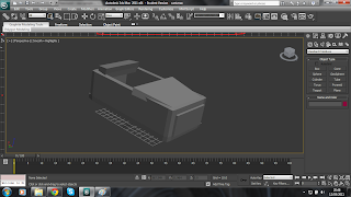
Now that i had my cart and the layout of my track i set about adding walls into the scene so as to break up the ride. With these completed i added a material of an old stone wall to them to finish the look.

I began my creating my ride layout on 3ds max, once i had completed this i straight away realiesed that with the effect i was going for my track would be way to long it would take over 3 minutes for the ride to be complete, i could speed up the cart but from my experience Ghost rides are generally slow and it is more about the surroundings than the speed. So i therefore reduce the length of my track so the ride would last just under a minute, i then set about designing my cart. When i was younger i played a game called Rollercoaster Tycoon, and decided to model my cart to a similiar of the ghost rides within the game nothing to over the top just a good shape and colour. Here is the result of my finished cart


Subscribe to:
Posts (Atom)